

CONTROLLING THE COLOUR AND APPEARANCE OF DURABLE GOODS
CONTROLLING THE COLOUR AND APPEARANCE OF DURABLE GOODS

Appearance is more than just colour. It’s an all-inclusive look at everything inherent to an object, including texture, gloss, transparency, translucency, and special effects like sparkle and shimmer. When viewed from different angles or under different lighting conditions, appearance effects can change our perception of colour. That's why it’s important to control both colour and appearance throughout design and development.
Durable goods brands use appearance effects to capture consumer attention. Since these products are often assembled using parts with different textures and micro-surface elements, appearance effects make colour control much more difficult. If the product components don't match once assembled – under every possible lighting condition – the product will fail inspection and be scrapped or sent to a discount store shelf.
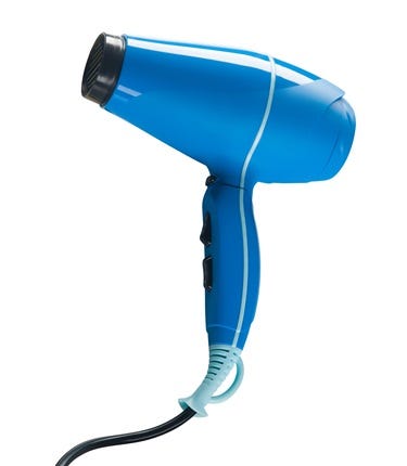
The question is: How would you communicate both colour and appearance of this blue swatch so a supplier can accurately and consistently produce it?

Controlling appearance is more complex than controlling colour. To get parts with various appearance characteristics to match, durable goods brands need to use the right digital tools at the right times. Here's how X-Rite and Pantone are helping to transform the design and production workflow to capture and depict appearance.
HOW TO HELP BRAND OWNERS COMMUNICATE COLOUR AND APPEARANCE FOR DURABLE GOODS
Many durable goods brands rely on handcrafted prototypes to communicate and approve colour and appearance. Although prototypes are more accurate than photographs, they are time-consuming to build, expensive to ship across global manufacturing workflows, and add a significant amount of time to review cycles. They also leave room for human error during measurement and visual evaluation.
Here's how durable goods brands can communicate detailed colour and appearance descriptions in a way that enables suppliers to execute against them.
1. Virtual Designs and Prototypes
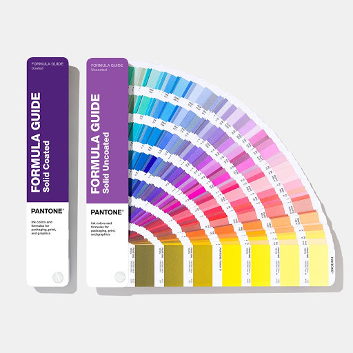
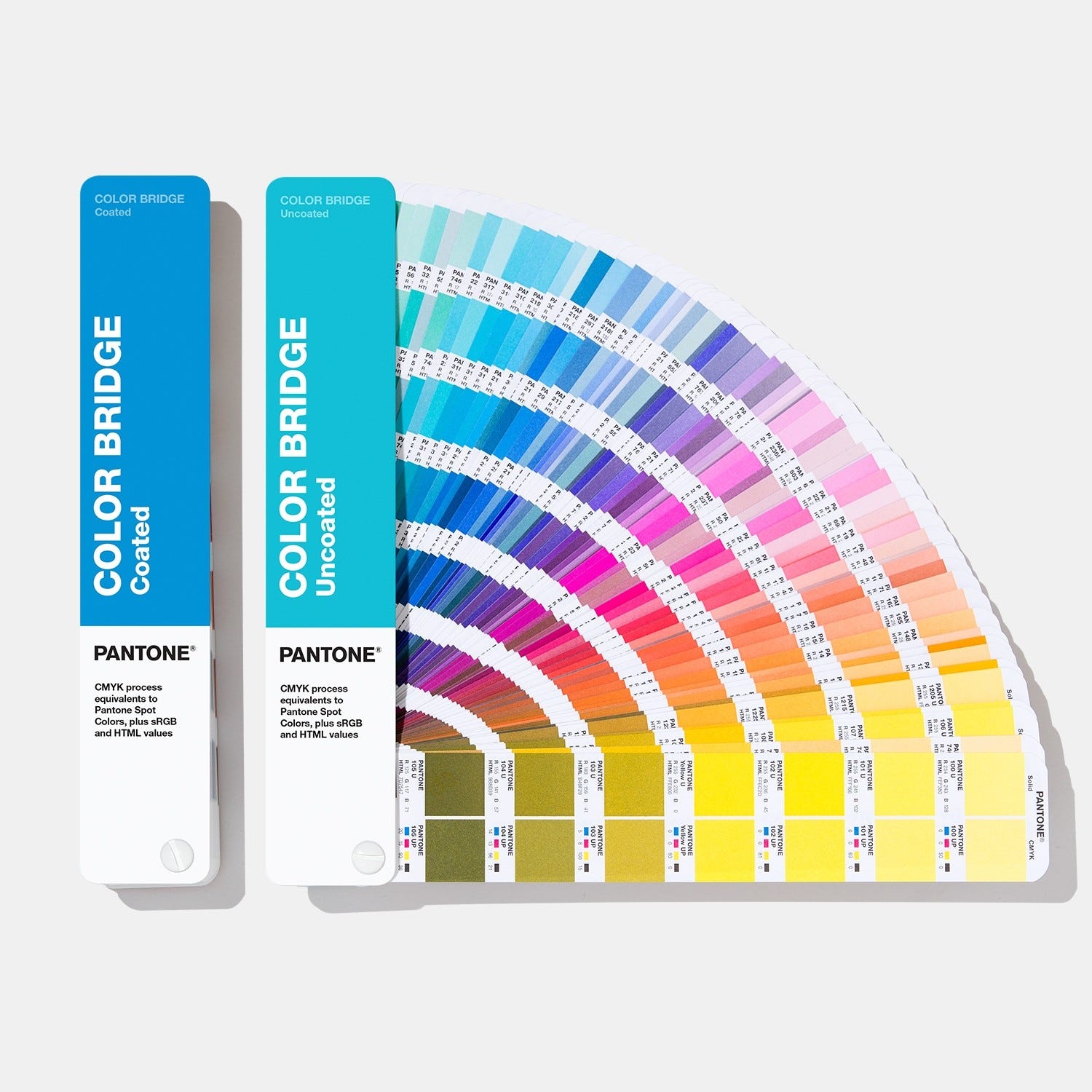
Virtual representations are an accurate and economical way to specify, design, and communicate appearance. They help brands expedite colour development by using the proper mix of physical and digital tools (like Pantone Colour Guides) to specify and communicate design intent and achievability.
3D CAD systems with photo-realistic rendering solutions save money, reduce waste, shorten review cycles, and stay ahead of colour trends. Using digital colour data ensures colour consistency and repeatability across the workflow; eliminates the variability that occurs when relying solely on physical standards; and reduces the back and forth between design, colour and production teams by using the right tools to communicate achievability on specified materials.
2. Virtual Appearance
X-Rite’s Total Appearance Capture (TAC) Ecosystem digitally captures both colour and appearance on material swatches. Brands can create virtual libraries of complex materials and manage samples with a single digital material library. Designers can use these digital material samples to “construct” virtual products and render accurate 3D prototypes that have the same visual appearance characteristics as their physical counterparts.
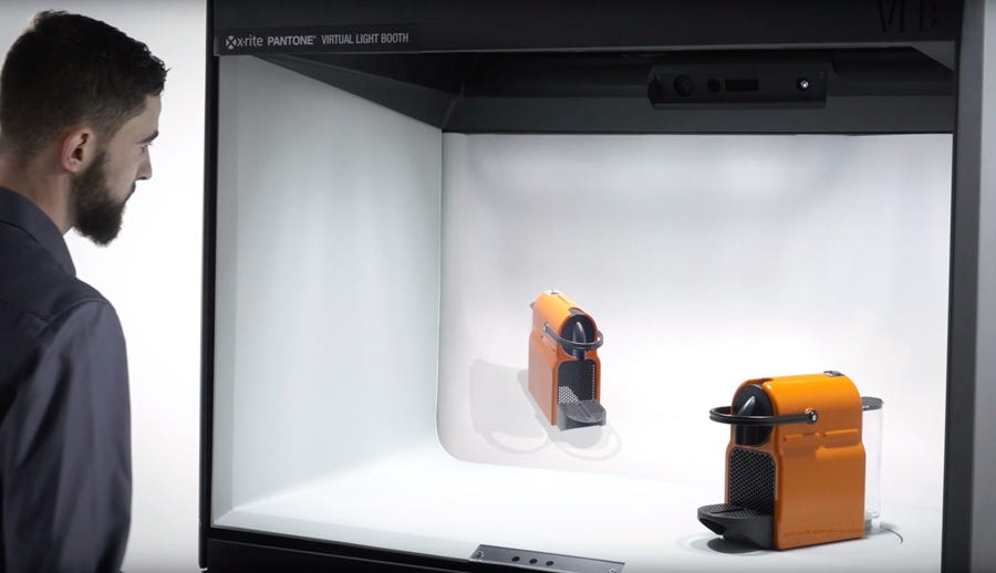
Part of the TAC ecosystem, the Virtual Light Booth offers an immersive 3D visualization to evaluate material appearance under multiple light sources and accurately compare digital and physical materials in an immersive mixed reality environment. Watch this video to learn more.
Using virtual representations during the design phase can help identify metamerism, streamline back and forth during reviews and approvals, eliminate the time and waste of physical prototypes, and set the stage for a colour-accurate production process.
3. Handoff to Production
Once the design is approved, the challenge turns to ensuring high quality colour and consistency throughout production.
HOW TO HELP MANUFACTURERS ENSURE CONSISTENT COLOUR FOR DURABLE GOODS ACROSS THE SUPPLY CHAIN
A typical durable goods production workflow requires a lot of back and forth between the brand colour specifier and the supply chain, tracking submits and approvals from different vendors across the globe. Utilizing digital colour with integrated colour management solutions builds a more sustainable process and helps manufacturers get up to colour fast and maintain it.
1. Spectral Colour Data
Using a spectrophotometer, brands can capture a precise spectral value and digitally communicate it to everyone involved in the workflow. Suppliers can enter the target spectral value and an acceptable tolerance into the spectrophotometer, then measure samples throughout production to ensure colour stays in tolerance. Watch how a sphere spectrophotometer can quickly measure durable goods and compare colour to a preset tolerance:
A sphere or multi-angle spectrophotometer is preferred for durable goods because it can capture colour and appearance on textured, metallic, optically brightened, and special effect finishes. X-Rite offers both handheld and benchtop versions.
To create standards, learn more about highly repeatable Ci7800 benchtop series.
For quality control around the factory or on the loading dock, learn more about Ci64 handheld spectrophotometer.
To control colour quality on metallic and special effect finishes, learn more about MA-5 QC portable spectrophotometer.
2. Computer-Aided Formulation
Many consumer goods use innovative bases, transparency, and special effects, making colour formulation a challenge. Colour iMatch formulation software can select cost-reducing parameters, such as lowest cost or fewest colorants, and determine the best formula for each application. It works with legacy databases and “learns” what works well so formulators can work faster and smarter as time goes on. This blog explains more about Colour iMatch’s improved formulation engine.
3. Colour Quality Control
Colour iQC software helps brands communicate colour data and monitor colour quality across sites.
Brand colourists can enter digital colour data to establish a colour standard and communicate it across the supply chain.
Quality control professionals can monitor colour quality in real time, demonstrate colour accuracy, and reduce rejects.
Brand owners can validate performance and track trends to share with customers and suppliers.
NetProfiler is a quality-assurance software that profiles, optimizes, and verifies all measurement devices are calibrated and performing as they should, giving customers piece of mind that they will deliver repeatable and consistent colour.
4. Visual Evaluation
When used properly, spectrophotometers and colour management software can tell you if colours are within tolerance. However, someone must visually evaluate these parts – next to each other and under different light sources – to make sure they are ready to ship. Check out Science of Visual Evaluation blog to learn more.
The SpectraLight QC light booth offers seven state-of-the-art light sources, more than any other on the market. It includes CIE Daylight, Cool White Fluorescent, Incandescent “A” & 2300K/Horizon, UVA, and two more fluorescent types (choice of U30, U35, TL83, and TL84), as well as an optional LED option. With SpectraLight QC, brand owners can create and share profiles across the supply chain and report and trace unit settings, lamp performance, operator certifications, and other features to ensure standardization.
5. An End-to-End Workflow
Using spectrophotometers, software, and controlled lighting, durable goods brands can efficiently formulate master standards, optimize the use of dyes, reuse leftover materials, and reduce approval cycles, as well as continuously monitor colour throughout the production workflow.
Discover More
To learn more about how X-Rite solutions can help durable goods brands shorten time to market, reduce waste and rework, and build a more sustainable process, check out How to Achieve the PANTONE® Color of the Year 2020 on Durable Goods and Consumer Electronics blog or get in touch for personalized assistance. And for those in Nigeria, you can contact Pantone Reseller - FLOURISH COLOUR VENTURES – www.flourishcolour.com WhatsApp or Call 08038629114 for the latest Pantone Colour Guides or for more information.
© Xrite.com
NB: Information on joju.substack.com is mostly adapted or culled from press releases or supporting affiliates’ contents and are thus copyright materials. These are not in any way the personal thought, opinion or view of the Publisher.